Story Effects Showcase
A working demonstration of every background type, scroll effect, content alignment, and title animation the story template supports.
Scroll to begin


The default background type: a single full-bleed image, bgStyle defaulting to scroll.
A flat solid-colour background, useful for pull-quote or transition sections between image-heavy chapters.
A 45° linear gradient between two hex colours.
A radial gradient, centred on the section.
A conic (“box”) gradient sweeping around the section.
A looping, muted, playsinline video background with a poster image shown until the video is
ready to play, and used as the static fallback under prefers-reduced-motion or no-JS.
The default background type: a single full-bleed image, bgStyle defaulting to scroll.
A 45° linear gradient between two hex colours.
A looping, muted, playsinline video background with a poster image shown until the video is
ready to play, and used as the static fallback under prefers-reduced-motion or no-JS.
A 45° linear gradient between two hex colours.

The background scrolls naturally with the page content — no pinning, no scrubbing.

The background stays fixed while this section’s content scrolls over it — the previous section reveals it, the next section covers it. Best for hero moments and image showcases.
Every section in this template is at minimum one full viewport tall — but never taller than it needs to be for short content, and never shorter than a screen for long content. This section exists purely to prove that second half of the rule: it holds enough copy that it should grow well past 100vh, pushing the next section down rather than clipping or scrolling internally.
That matters for real long-form work. A photo essay chapter might carry two sentences of caption under a single image, or it might carry six paragraphs of reported narrative — the section template has to hold both without the shorter ones feeling like empty stretches of scroll and without the longer ones getting compressed into a scrollable box-within-a-box, which breaks the full-page scroll-driven feel the whole format depends on.
In practice this means the section’s minimum height is set with min-height: 100vh (or the
svh/dvh equivalents once mobile viewport units are safe to rely on across the target browser
set) rather than a fixed height, so content is always free to push the box taller. Background
effects that rely on scroll-scrubbed progress through the section — scrollpin, fade,
crossfade — need their ScrollTrigger start/end bound to the section’s actual rendered height,
not a hard-coded viewport multiple, or they’ll finish early on sections like this one and sit idle
for the rest of the scroll.
Worth checking specifically on a small phone in landscape orientation, where “one viewport tall” is a much shorter distance than on desktop, and long sections like this one will need considerably more scrolling to clear.
Every section in this template is at minimum one full viewport tall — but never taller than it needs to be for short content, and never shorter than a screen for long content. This section exists purely to prove that second half of the rule: it holds enough copy that it should grow well past 100vh, pushing the next section down rather than clipping or scrolling internally.
That matters for real long-form work. A photo essay chapter might carry two sentences of caption under a single image, or it might carry six paragraphs of reported narrative — the section template has to hold both without the shorter ones feeling like empty stretches of scroll and without the longer ones getting compressed into a scrollable box-within-a-box, which breaks the full-page scroll-driven feel the whole format depends on.
In practice this means the section’s minimum height is set with min-height: 100vh (or the
svh/dvh equivalents once mobile viewport units are safe to rely on across the target browser
set) rather than a fixed height, so content is always free to push the box taller. Background
effects that rely on scroll-scrubbed progress through the section — scrollpin, fade,
crossfade — need their ScrollTrigger start/end bound to the section’s actual rendered height,
not a hard-coded viewport multiple, or they’ll finish early on sections like this one and sit idle
for the rest of the scroll.
Worth checking specifically on a small phone in landscape orientation, where “one viewport tall” is a much shorter distance than on desktop, and long sections like this one will need considerably more scrolling to clear.
Every section in this template is at minimum one full viewport tall — but never taller than it needs to be for short content, and never shorter than a screen for long content. This section exists purely to prove that second half of the rule: it holds enough copy that it should grow well past 100vh, pushing the next section down rather than clipping or scrolling internally.
That matters for real long-form work. A photo essay chapter might carry two sentences of caption under a single image, or it might carry six paragraphs of reported narrative — the section template has to hold both without the shorter ones feeling like empty stretches of scroll and without the longer ones getting compressed into a scrollable box-within-a-box, which breaks the full-page scroll-driven feel the whole format depends on.
In practice this means the section’s minimum height is set with min-height: 100vh (or the
svh/dvh equivalents once mobile viewport units are safe to rely on across the target browser
set) rather than a fixed height, so content is always free to push the box taller. Background
effects that rely on scroll-scrubbed progress through the section — scrollpin, fade,
crossfade — need their ScrollTrigger start/end bound to the section’s actual rendered height,
not a hard-coded viewport multiple, or they’ll finish early on sections like this one and sit idle
for the rest of the scroll.
Worth checking specifically on a small phone in landscape orientation, where “one viewport tall” is a much shorter distance than on desktop, and long sections like this one will need considerably more scrolling to clear.
Every section in this template is at minimum one full viewport tall — but never taller than it needs to be for short content, and never shorter than a screen for long content. This section exists purely to prove that second half of the rule: it holds enough copy that it should grow well past 100vh, pushing the next section down rather than clipping or scrolling internally.
That matters for real long-form work. A photo essay chapter might carry two sentences of caption under a single image, or it might carry six paragraphs of reported narrative — the section template has to hold both without the shorter ones feeling like empty stretches of scroll and without the longer ones getting compressed into a scrollable box-within-a-box, which breaks the full-page scroll-driven feel the whole format depends on.
In practice this means the section’s minimum height is set with min-height: 100vh (or the
svh/dvh equivalents once mobile viewport units are safe to rely on across the target browser
set) rather than a fixed height, so content is always free to push the box taller. Background
effects that rely on scroll-scrubbed progress through the section — scrollpin, fade,
crossfade — need their ScrollTrigger start/end bound to the section’s actual rendered height,
not a hard-coded viewport multiple, or they’ll finish early on sections like this one and sit idle
for the rest of the scroll.
Worth checking specifically on a small phone in landscape orientation, where “one viewport tall” is a much shorter distance than on desktop, and long sections like this one will need considerably more scrolling to clear.

The background stays fixed while this section’s content scrolls over it — the previous section reveals it, the next section covers it. Best for hero moments and image showcases.
Every section in this template is at minimum one full viewport tall — but never taller than it needs to be for short content, and never shorter than a screen for long content. This section exists purely to prove that second half of the rule: it holds enough copy that it should grow well past 100vh, pushing the next section down rather than clipping or scrolling internally.
The background fades in as you scroll into the section, and fades out as you leave it.
The background scrolls in, pins while this text is read, then scrolls out — ideal for long-form content that needs sustained focus time over one image.
The background scrolls in, pins while this text is read, then scrolls out — ideal for long-form content that needs sustained focus time over one image.
The background scrolls in, pins while this text is read, then scrolls out — ideal for long-form content that needs sustained focus time over one image.


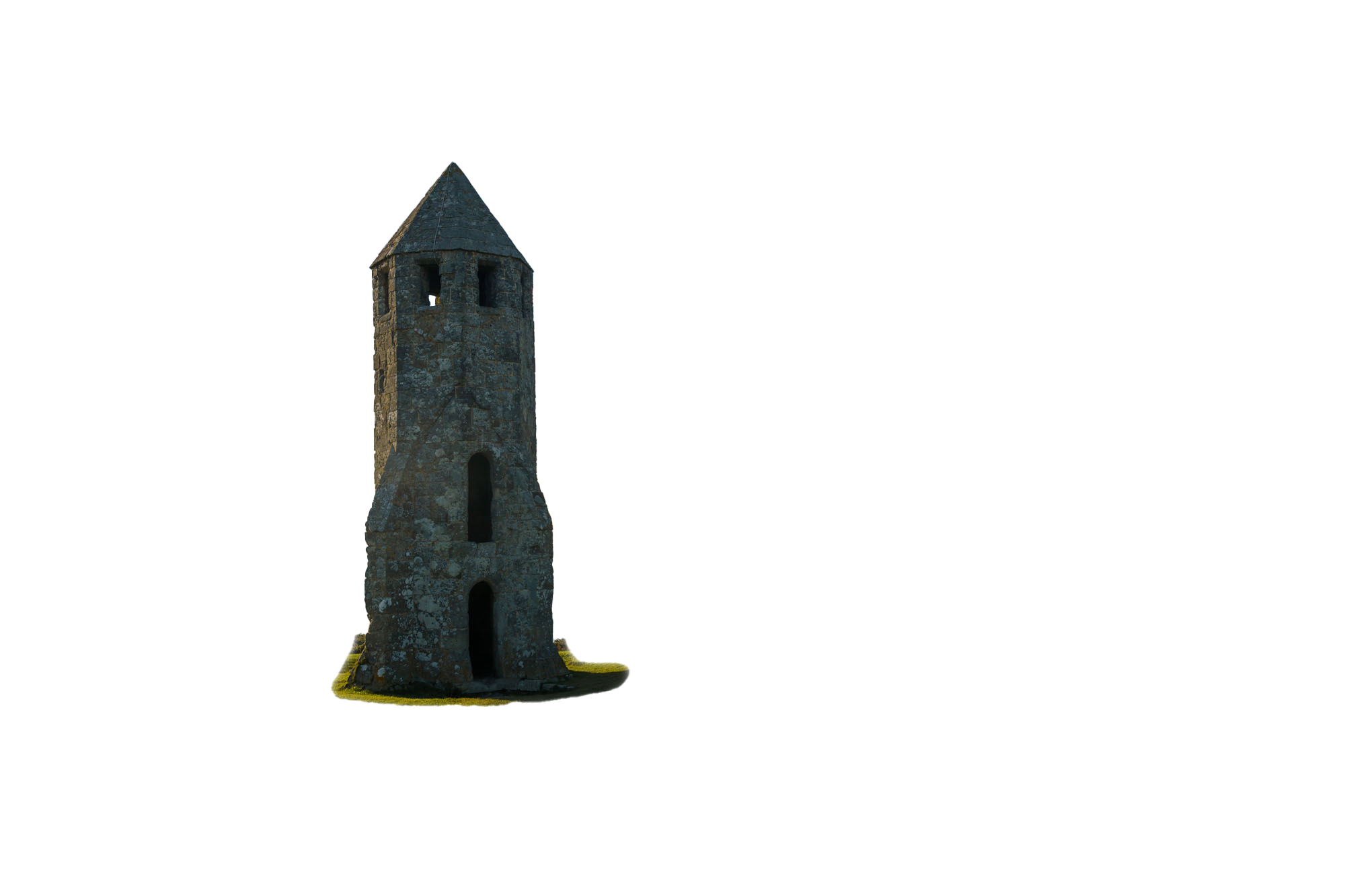
Three layers move at independent speeds as you scroll, creating a 3D depth effect. Lower
parallaxSpeed values sit further back and move more slowly.


Three-phase: the first image scrolls in, the images crossfade evenly between each other with no flash of the page background, then the last image scrolls out. Works with any number of images.
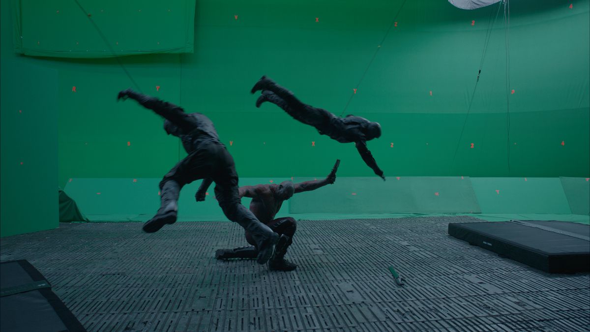
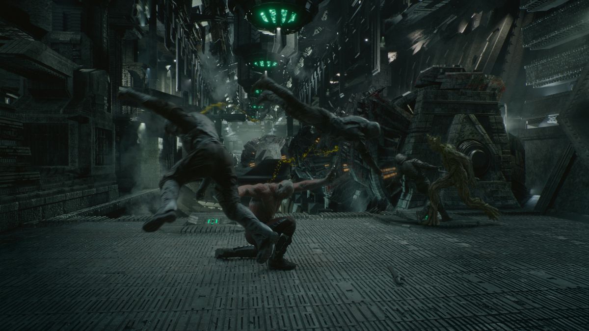
A scroll-driven before/after comparison: the first (“before”) image scrolls in, a wipe at 0° (left-to-right) reveals the second (“after”) image underneath, then it scrolls out.
A scroll-driven before/after comparison: the first (“before”) image scrolls in, a wipe at 0° (left-to-right) reveals the second (“after”) image underneath, then it scrolls out.
A scroll-driven before/after comparison: the first (“before”) image scrolls in, a wipe at 0° (left-to-right) reveals the second (“after”) image underneath, then it scrolls out.
The background should scroll when not set
The title and body text block sits against the left edge of the section, leaving the right side clear for the background to breathe. On mobile this collapses to centred regardless of the setting here.
The title and body text block sits against the left edge of the section, leaving the right side clear for the background to breathe. On mobile this collapses to centred regardless of the setting here.
The text block sits against the right edge instead. This is also the alignment that pairs with a
left-pinned pinImage — see the Positioned Image section further down.
The text block sits against the right edge instead. This is also the alignment that pairs with a
left-pinned pinImage — see the Positioned Image section further down.
Centred text, the only alignment available on mobile regardless of what’s set here — every other section in this showcase collapses to this layout below the tablet breakpoint.
No contentAlign set here at all — this section is checking that the template falls back to
centre by default (see THEME_SPEC.md §8.7) rather than erroring or rendering unstyled.
Every section in this template is at minimum one full viewport tall — but never taller than it needs to be for short content, and never shorter than a screen for long content. This section exists purely to prove that second half of the rule: it holds enough copy that it should grow well past 100vh, pushing the next section down rather than clipping or scrolling internally.
That matters for real long-form work. A photo essay chapter might carry two sentences of caption under a single image, or it might carry six paragraphs of reported narrative — the section template has to hold both without the shorter ones feeling like empty stretches of scroll and without the longer ones getting compressed into a scrollable box-within-a-box, which breaks the full-page scroll-driven feel the whole format depends on.
In practice this means the section’s minimum height is set with min-height: 100vh (or the
svh/dvh equivalents once mobile viewport units are safe to rely on across the target browser
set) rather than a fixed height, so content is always free to push the box taller. Background
effects that rely on scroll-scrubbed progress through the section — scrollpin, fade,
crossfade — need their ScrollTrigger start/end bound to the section’s actual rendered height,
not a hard-coded viewport multiple, or they’ll finish early on sections like this one and sit idle
for the rest of the scroll.
Worth checking specifically on a small phone in landscape orientation, where “one viewport tall” is a much shorter distance than on desktop, and long sections like this one will need considerably more scrolling to clear.
Every section in this template is at minimum one full viewport tall — but never taller than it needs to be for short content, and never shorter than a screen for long content. This section exists purely to prove that second half of the rule: it holds enough copy that it should grow well past 100vh, pushing the next section down rather than clipping or scrolling internally.
That matters for real long-form work. A photo essay chapter might carry two sentences of caption under a single image, or it might carry six paragraphs of reported narrative — the section template has to hold both without the shorter ones feeling like empty stretches of scroll and without the longer ones getting compressed into a scrollable box-within-a-box, which breaks the full-page scroll-driven feel the whole format depends on.
In practice this means the section’s minimum height is set with min-height: 100vh (or the
svh/dvh equivalents once mobile viewport units are safe to rely on across the target browser
set) rather than a fixed height, so content is always free to push the box taller. Background
effects that rely on scroll-scrubbed progress through the section — scrollpin, fade,
crossfade — need their ScrollTrigger start/end bound to the section’s actual rendered height,
not a hard-coded viewport multiple, or they’ll finish early on sections like this one and sit idle
for the rest of the scroll.
Worth checking specifically on a small phone in landscape orientation, where “one viewport tall” is a much shorter distance than on desktop, and long sections like this one will need considerably more scrolling to clear.
Every section in this template is at minimum one full viewport tall — but never taller than it needs to be for short content, and never shorter than a screen for long content. This section exists purely to prove that second half of the rule: it holds enough copy that it should grow well past 100vh, pushing the next section down rather than clipping or scrolling internally.
That matters for real long-form work. A photo essay chapter might carry two sentences of caption under a single image, or it might carry six paragraphs of reported narrative — the section template has to hold both without the shorter ones feeling like empty stretches of scroll and without the longer ones getting compressed into a scrollable box-within-a-box, which breaks the full-page scroll-driven feel the whole format depends on.
In practice this means the section’s minimum height is set with min-height: 100vh (or the
svh/dvh equivalents once mobile viewport units are safe to rely on across the target browser
set) rather than a fixed height, so content is always free to push the box taller. Background
effects that rely on scroll-scrubbed progress through the section — scrollpin, fade,
crossfade — need their ScrollTrigger start/end bound to the section’s actual rendered height,
not a hard-coded viewport multiple, or they’ll finish early on sections like this one and sit idle
for the rest of the scroll.
Worth checking specifically on a small phone in landscape orientation, where “one viewport tall” is a much shorter distance than on desktop, and long sections like this one will need considerably more scrolling to clear.
Every section in this template is at minimum one full viewport tall — but never taller than it needs to be for short content, and never shorter than a screen for long content. This section exists purely to prove that second half of the rule: it holds enough copy that it should grow well past 100vh, pushing the next section down rather than clipping or scrolling internally.
That matters for real long-form work. A photo essay chapter might carry two sentences of caption under a single image, or it might carry six paragraphs of reported narrative — the section template has to hold both without the shorter ones feeling like empty stretches of scroll and without the longer ones getting compressed into a scrollable box-within-a-box, which breaks the full-page scroll-driven feel the whole format depends on.
In practice this means the section’s minimum height is set with min-height: 100vh (or the
svh/dvh equivalents once mobile viewport units are safe to rely on across the target browser
set) rather than a fixed height, so content is always free to push the box taller. Background
effects that rely on scroll-scrubbed progress through the section — scrollpin, fade,
crossfade — need their ScrollTrigger start/end bound to the section’s actual rendered height,
not a hard-coded viewport multiple, or they’ll finish early on sections like this one and sit idle
for the rest of the scroll.
Worth checking specifically on a small phone in landscape orientation, where “one viewport tall” is a much shorter distance than on desktop, and long sections like this one will need considerably more scrolling to clear.

This section is content-right, so pinImage pins to the left, at roughly 40% of the
viewport width, fading/sliding in as this section enters and out as it leaves. It’s meant for
testimonial portraits, article image callouts, or embedded data visualisations that need to stay
put while several paragraphs of related text scroll past.
On mobile, this same image renders inline at full width in normal document flow — no pinning on touch devices, regardless of viewport width (THEME_SPEC.md §8.8).

No animation — the title is simply visible. This is also the state every titleStyle collapses
to under prefers-reduced-motion: reduce or with JavaScript unavailable.

The default. Individual characters fade in and slide up from below as the title scrolls into view.

The whole title fades in as a single unit, no per-character stagger.

Characters animate up and down in a travelling wave as they appear, rather than all rising together.


The title splits — by word or half — and the pieces converge/slide together into place. Paired here with a two-layer parallax background to show effects composing cleanly.
The title is revealed through a clip-path/mask wipe rather than an opacity or position tween.
The title itself translates into position as the section enters — the whole block moves as one
unit, distinct from the per-character characters style.

Characters cycle through random glyphs before resolving to the final text (GSAP
ScrambleTextPlugin) — the highest-risk animation for low-end mobile performance, flagged in
THEME_SPEC.md’s open items for early prototyping.
This should show CustomTile in the submenu not “Custom Link Title Exmaple”